CSS clip — застаріле обрізання елемента
Властивість clip визначає розміри прямокутної області позиціонованого елемента, в якій буде показано його вміст.
Все, що не поміщається в цю область, буде обрізано та стане невидимим.
Властивість clip працює тільки з абсолютно позиційованими елементами (зі значеннями position і fixed) та не працює якщо для елемента задана властивість overflow: visible.
Як значення використовується відстань від краю елемента до області вирізки, яке задається в одиницях CSS - пікселі (px), em та ін. Якщо край області потрібно залишити без змін, слід встановити auto.
Загальний опис
автор: NagarD
- Нотатка
-
Властивість
автор: NagarDclipвважається застарілою. Замість неї, рекомендується використовуватиclip-path. Деякі браузери до сих пір підтримують її, але Ви маєте бути обережними: ця властивість може бути видалена остаточно будь коли!
Синтаксис
clip: auto|shape|initial|inherit;Властивість clip може отримувати 4 значень:
-
auto -
Все залишиться без змін
автор: NagarD -
shape -
Єдине допустиме значення:
автор: NagarDrect (top, right, bottom, left) -
initial -
Встановлює властивість у значення без задання
автор: NagarD -
inherit -
Вказує на спадковість властивості від свого батьківського елемента
автор: NagarD
| Значення без задання: | auto |
|---|---|
| Наслідує: | Ні |
| Анімується: | Так |
| JavaScript синтаксис: | object.style.clip="rect(0px,50px,50px,0px)" |
Переглядачі
| Переглядач |  |
 |
 |
 |
 |
 |
|---|---|---|---|---|---|---|
| 1 | 1 | 1 | 7 | 12 | 4 |
| Переглядач |  |
 |
 |
 |
|---|---|---|---|---|
| 4.4 | 18 | 4 | 1 |
Приклади
+ запропонувати свій приклад у пісочниці
Застаріла властивість clip обрізає абсолютно позиціонований елемент прямокутником rect(верх, право, низ, ліво): праворуч — те саме лого, від якого видно лише смугу 60px завширшки. У новому коді використовуй clip-path.
HTML
<div class="area">
    <img src="/img/logo.svg" alt="повне зображення">
    <img class="cut" src="/img/logo.svg" alt="обрізане clip-ом">
</div>
CSS
.area {
    position: relative;
    height: 140px;
}

img {
    width: 120px;
}

.cut {
    position: absolute;
    left: 160px;
    top: 0;
    clip: rect(0px, 60px, 200px, 0px);
}Динамічний приклад
HTML
<div class="box">

<p>У цьому прикладі, Ви можете змінювати значення для властивості <strong>clip</strong>.</p>

<p>Вона встановлює область, яка буде показана на сторінці. Все інше буде приховано.</p>

<strong>clip: rect(</strong>
<input type="number" class="input" id="input1" value="0">px,
<input type="number" class="input" id="input2" value="800">px,
<input type="number" class="input" id="input3" value="800">px,
<input type="number" class="input" id="input4" value="0">px
<strong>);</strong>

</div>
CSS
* {
  box-sizing: border-box;
}

body {
  font-family: monospace;
  font-size: 16px;
  line-height: 1.45;
  height: 100vh;
  padding: 16px;
}

.box {
  background-color: #f7f7f7;
  padding: 16px;
  border: 2px solid #666;
  position: absolute;
  clip: rect(0px, 800px, 800px, 0px);
  transition: clip .15s ease-in;
}

.input {
  margin-bottom: 36px;
  width: 75px;
}

#select {
  position: relative;
  top: -4px;
  width: 100px;
}
JS
document.querySelectorAll('.input').forEach((el) => el.addEventListener('change', function () {
  var input1 = document.querySelector('#input1').value;
  var input2 = document.querySelector('#input2').value;
  var input3 = document.querySelector('#input3').value;
  var input4 = document.querySelector('#input4').value;
  document.querySelectorAll('.box').forEach((n) => n.style.setProperty('clip', 'rect(' + input1 + 'px, ' + input2 + 'px, ' + input3 + 'px, ' + input4 + 'px)'));
}));HTML
<div>Це обрізаний блок</div>CSS
div {

  background: url("data:image/svg+xml,%3Csvg xmlns='http://www.w3.org/2000/svg' width='300' height='300' viewBox='0 0 40 40' preserveAspectRatio='none'%3E%3Crect width='40' height='40' fill='%23264653'/%3E%3Cpath d='M0 40 12 18 22 30 30 22 40 40Z' fill='%232a9d8f'/%3E%3Ccircle cx='30' cy='9' r='5' fill='%23e9c46a'/%3E%3C/svg%3E") no-repeat;
  background-size: 225px;

  clip: rect(6px, 155px, 145px, 2px);

  height: 350px;
  width: 350px;
  position: absolute;
  top: 36px;
  left: 36px;

  color: #fff;
  font-size: 18px;
}Демонстрація роботи властивості
HTML
<div class="info">
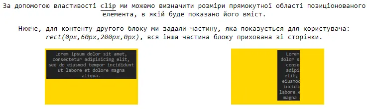
	<p>За допомогою властивості <code>clip</code> ми можемо визначити розміри прямокутної області позиціонованого елемента, в якій буде показано його вміст.</p>
	<p>Нижче, для контенту другого блоку ми задали частину, яка показується для користувача: <em>rect(0px,60px,200px,0px)</em>, вся інша частина блоку прихована зі сторінки.</p>
</div>

<div class="wrapper">
	<div class="block one">
		<div class="content">
			<p>Lorem ipsum dolor sit amet, consectetur adipisicing elit, sed do eiusmod
			tempor incididunt ut labore et dolore magna aliqua.</p>
		</div>
	</div>
	<div class="block two">
		<div class="content">
			<p>Lorem ipsum dolor sit amet, consectetur adipisicing elit, sed do eiusmod
			tempor incididunt ut labore et dolore magna aliqua.</p>
		</div>
	</div>
</div>
CSS
* {
	box-sizing: border-box;
}

body {
	font-family: monospace;
	font-size: 17px;
}

.info {
	padding: 4px 6px;
}

.info p {
	margin-bottom: 16px;
	margin-top: 0;
}

code {
	font-weight: 700;
	color: #444;
	border-bottom: 2px solid #666;
}

.wrapper {
	display: flex;
	justify-content: space-around;
}

.block {
	width: 25%;
	height: 150px;
	background-color: gold;
	position: relative;
	font-size: 13px;
	padding: 4px;
}

.content {
	color: #999;
	background-color: #222;
	padding: 2px 4px;
	display: inline-block;
}

.content p {
	margin: 0;
}

.block.two .content {
	position: absolute;
  clip: rect(0px,60px,200px,0px);
}Динамічний приклад зміни значень clip
HTML
<div class="form">
  <p>Введіть нові значення, щоб змінити координати обрізання блоку нижче:</p>
  <input type="number" min="0" placeholder="top" name="top" onchange="clipBlock(this.name, this.value)">
  <input type="number" min="0" placeholder="right" name="right" onchange="clipBlock(this.name, this.value)">
  <input type="number" min="0" placeholder="bottom" name="bottom" onchange="clipBlock(this.name, this.value)">
  <input type="number" min="0" placeholder="left" name="left" onchange="clipBlock(this.name, this.value)">
</div>

<div class="wrapper">
  <div id="block">
    <p>Це обрізаний блок!</p>
  </div>
</div>
CSS
.form {
  margin: 16px 0;
  text-align: center;
  padding-bottom: 36px;
  border-bottom: 2px dashed #666;
}

.form input[type=number] {
  padding: 6px 12px;
}

p {
  color: #222;
  font-family: monospace;
  font-size: 16px;
}

.wrapper {
  position: relative;
  height: 250px;
}

#block {
  background-color: #eee;
  border: 2px solid #666;
  width: 250px;
  height: 150px;
  text-align: center;
  line-height: 120px;
  position: absolute;
  top: 16px;
  left: 16px;
}
JS
var block = document.getElementById('block');
var newVal = { 'top': 0,
  'right': 0,
  'bottom': 0,
  'left': 0 };

function clipBlock(field, value) {
  newVal[field] = value;
  block.style.clip = 'rect(' + newVal['top'] + 'px, ' + newVal['right'] + 'px, ' + newVal['bottom'] + 'px, ' + newVal['left'] + ')';
  console.log(newVal);
}
//# sourceURL=pen.jsТой самий блок без clip і з clip: rect(...): пунктир показує, що місце в розкладці не змінилось.
HTML
<p>Без clip:</p>
<div class="wrap">
    <div class="box">Вміст блока видно повністю, від краю до краю.</div>
</div>

<p>З clip: rect(0, 240px, 28px, 0):</p>
<div class="wrap">
    <div class="box cut">Вміст блока видно повністю, від краю до краю.</div>
</div>
CSS
.wrap {
    position: relative;
    width: 240px;
    height: 80px;
    margin-bottom: 16px;
    border: 1px dashed #999;
}

.box {
    position: absolute;
    inset: 0;
    padding: 6px;
    background: #dbeafe;
}

.cut {
    clip: rect(0, 240px, 28px, 0);
}Коментарі
Коментарів ще немає — будьте першим!